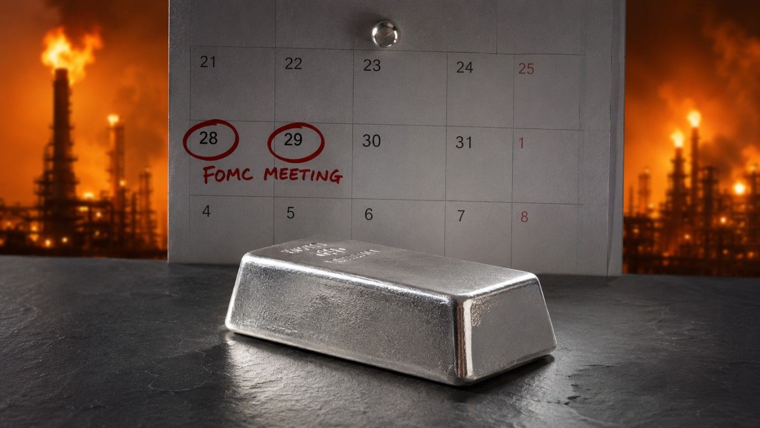
![]() Silver Rises Over 120% YTD Invest Now
Silver Rises Over 120% YTD Invest Now ![]()


Samantha is wonderful. I was nervous about spending a chunk of money. I asked her to `hold my hand’ and walk me through making my purchase.
She laughed and guided me through, step by step. She was so helpful in explaining everything...
Travis was amazing! I was having difficulty with a wire transfer of my life’s savings, and I was very worried that I might not be able to receive it all. My husband just passed away and I’ve been worried about these funds along with grieving for 8 months. As soon as I got connected with Travis, my concerns were immediately addressed and he put me at ease. The issue was resolved within days. He even called me back with updates to keep me in the loop about what was going on with the funds. I am so grateful for a customer representative like Travis. He really cares for his clients.
Sam was also very helpful! I called and was connected to Sam within 30 seconds. She helped me with a fee that was charged to my account. She had a great attitude and took care of the fee quickly.

Outstanding quality and customer service. I first discovered Mike Maloney through his “Secrets of Money” video series. It was an excellent precious metals education. I was a financial advisor and it really helped me learn more about wealth protection. I used this knowledge to help protect my clients retirements. I purchase my precious metals through goldsilver.com. It is easy, fast and convenient. I also invested my IRA’s and utilize their excellent storage options. Bottom line, Mike and his team have earned my trust. I continue to invest in wealth protection and my own education. I give back and help others see the opportunities to invest in precious metals. Thank you.